This homework looks at three ways design affects behaviour: the actions an object suggests, the visual groups people perceive, and the choices an interface tries to steer.
Lecture 1 - Affordances Link to heading
An affordance is an action that an object makes possible. Its shape and signs help people discover that action. A well-designed door needs little explanation.
Good example: a crash bar on an exit door Link to heading
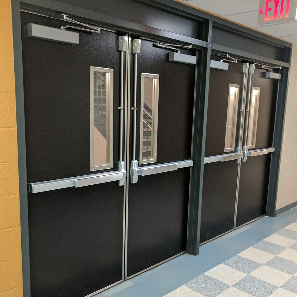
Figure 1. A horizontal crash bar suggests “push here” through its size, position, and direction.
The wide horizontal bar sits exactly where a person naturally places their hands or body when leaving. Pushing it is easy, even when carrying something or moving quickly. The physical form matches the intended action, so the sign is only a confirmation rather than the main instruction.
Bad example: competing push and pull signs Link to heading
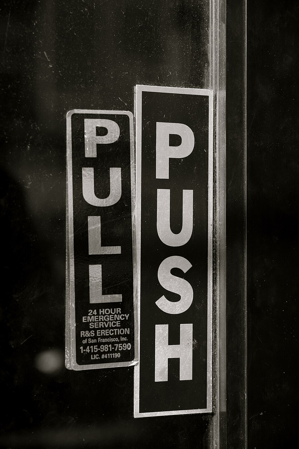
Figure 2. Push and pull labels competing on a glass door.
The photograph shows overlapping Push and Pull labels. Read together, they leave the intended action unclear. There is no clear physical cue visible in the picture to resolve the conflict. The door still allows an action, but its signs do not communicate that action clearly.
Redesign: show only the correct instruction for the approached side. Use a flat push plate on the push side and a handle only on the pull side, so the physical form supports the instruction.
Lecture 2 - Gestalt Laws Link to heading
Gestalt laws describe how people visually group elements. The following cases show what happens when that grouping is not supported by the layout.
1. Proximity: labels too far from their fields Link to heading
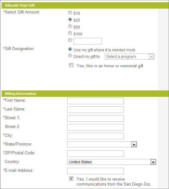
Figure 3. An archived San Diego Zoo donation form, 2013.
The labels are grouped on the left, while the fields form another group on the right. The wide gap makes it harder to connect a short label to its box. The user has to follow the row across the screen instead of seeing each label and field as one pair.
Correction: put each label directly above its field, with a small gap inside the pair and a larger gap before the next pair. Proximity would then support the task rather than separate related information.
2. Similarity: every action looks equally important Link to heading
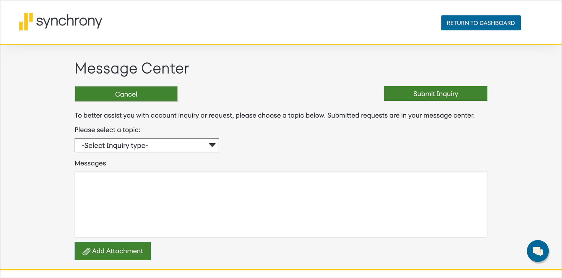
Figure 4. An archived Synchrony Bank message form, 2020.
Cancel, Submit Inquiry, and Add Attachment all use the same solid green style. Similarity groups them as equivalent actions, although sending the message is the main task. Adding a file is optional, and cancelling abandons the task. The visual hierarchy does not communicate this difference.
Correction: keep Submit Inquiry as the solid primary button. Use an outlined button for Add Attachment and a separate text button for Cancel. Keep clear labels, so the distinction does not depend on colour alone.
Lecture 3 - Dark Design Patterns Link to heading
Dark patterns steer people towards choices that benefit the service rather than the user. These two archived examples show emotional pressure and unnecessary friction.
1. Confirmshaming: a Sears signup popup Link to heading
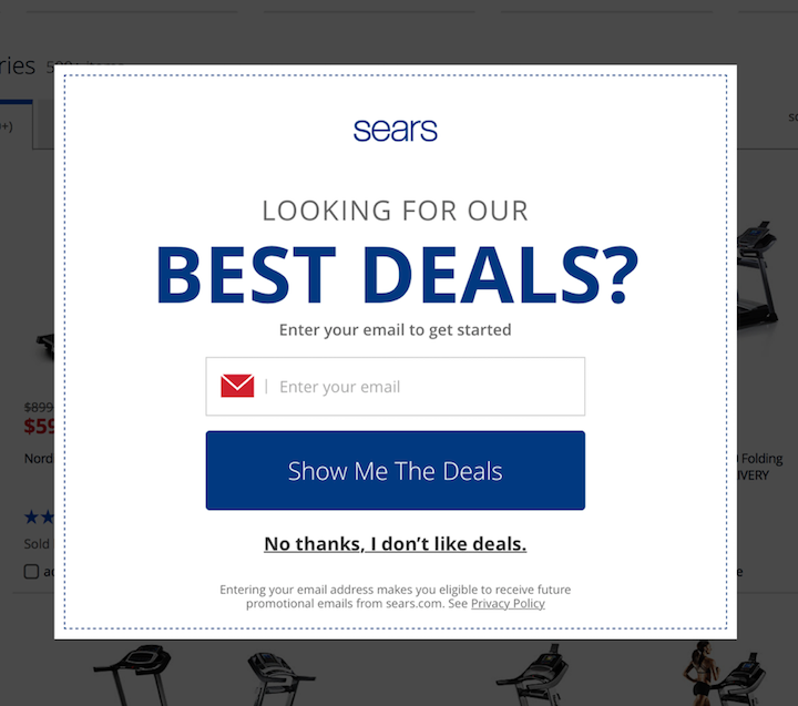
Figure 5. An archived Sears email signup popup, 2017.
The main button promises deals. Declining requires clicking “No thanks, I don’t like deals.” This turns a simple decision about marketing emails into a negative statement about the user. The smaller rejection link also makes saying no less prominent.
Opposite redesign: say clearly that the offer involves email signup. Present Subscribe and No thanks as equally readable choices, with a visible close button. Declining should not require accepting an insulting description.
2. Obstruction: the old Amazon Prime cancellation flow Link to heading
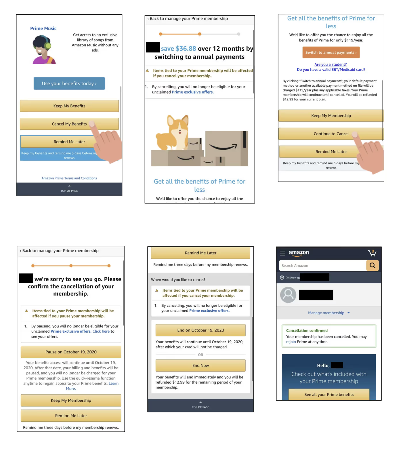
Figure 6. Part of the cancellation flow recorded in a 2021 study. This is a historical example, not a claim about the current interface.
The user has already decided to leave, but must pass more offers and repeat the decision. The wording also changes from Cancel My Benefits to Continue to Cancel and then End Now. Each screen asks the user to work out again which action actually continues cancellation.
Opposite redesign: place Cancel subscription in membership settings. Show the end date, any refund, and the choice of ending now or at the billing date on one screen. One confirmation should complete the request and show a clear receipt. Retention offers should not block this path.