Lecture 7 - Three ideas for augmenting human abilities Link to heading
I focused on small difficulties that AR could help with: finding a place, understanding language, and remembering a sequence of actions.
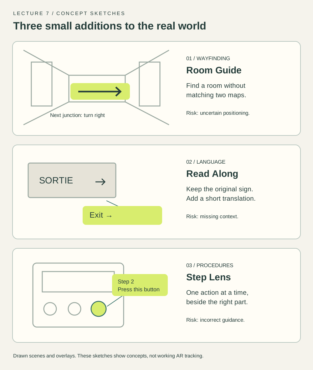
Concept sketches. The backgrounds and overlays are schematic.
Room Guide. Show the next direction near a corridor junction, with the destination name always visible. It could reduce the effort of matching a floor plan to the place in front of you. Wrong or outdated positioning would be its main weakness.
Read Along. Place a translation beside a sign or a short caption below a speaker. This could help in an unfamiliar language. Long text would need a separate reading view; covering the original sign could hide important information.
Step Lens. Put one instruction beside the relevant part of a machine. Keep the next step hidden until the current one is confirmed. It could support an unfamiliar procedure, but object recognition and the correctness of instructions would need careful checking.
I chose Room Guide because a short route can be represented and tried without AR hardware. The first question is whether people understand the directions, before attempting real spatial tracking.
Lecture 8 - A prototype of Room Guide Link to heading
Open the interactive prototype.
The prototype runs in a browser. It uses a fictional building with three destinations: HCI Studio, Library, and Student Desk. None of these routes describe the actual campus.
Choose a room, start the route, and use Next location to simulate movement. Each location shows a direction, a landmark, and the remaining distance. Overview reveals the floor plan; Stop route returns to destination selection. Simulate missed turn shows how the interface handles a wrong direction.
The drawn corridor stands in for a view through AR glasses. Buttons stand in for movement and selection. There is no camera feed, indoor positioning, or gesture recognition. This is enough to try the wording and screen sequence, but not to judge alignment, walking comfort, or tracking accuracy.
The route uses both words and arrows. Colour reinforces the instruction without being the only cue. A visible stop control lets the person leave the route at any time.
Lecture 9 - Evaluation Link to heading
Three people tried Room Guide. The feedback below is grouped by task.
Finding HCI Studio. Selecting the destination, starting the route, and pressing Next location three times led to arrival without a reported difficulty. Focus then moved to Choose another room. One detail didn’t match the map: the third instruction said “Look for H201 on your left”, while the room was drawn across the end of the right-hand corridor.
Checking the Library overview. This task could be completed, but the Noticeboard label appeared between the entrance and the junction. The turn itself happened at the junction. The first position marker also overlapped the label, leaving uncertainty about where to turn. Overview was disabled before starting, without explaining why; someone wanting to check the route first had no obvious way to do so.
Recovering from a missed turn. Recovery worked, but this was the most awkward part. Simulate missed turn was a small secondary button on a separate row, so it was easy to overlook. “Return to the last location” didn’t name the place. At the first step, before any movement, returning to a previous location made little sense. Moving focus back to Next location after recovery was a useful detail.
What I would change Link to heading
First, place the Noticeboard marker at the junction and make the H201 instruction agree with the room’s position. I would also allow the overview before starting a route. For recovery, a message such as “Return to the Noticeboard, then turn left” would be clearer than “last location”. The recovery control should be more visible and only offer a previous location when one exists.
Completing a route didn’t mean every instruction was clear. The main problems were consistency between the map and the text, and vague recovery wording. These are proposed revisions to the tested version. The three-person browser test identifies interface issues; it doesn’t establish how well the directions would work while walking with AR glasses.